
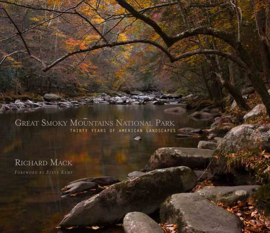
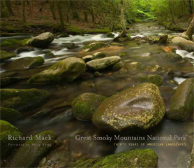
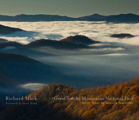
Great Smoky Mountains National Park: Thirty Years of American Landscapes
ISBN: 978-0-9753954-2-4
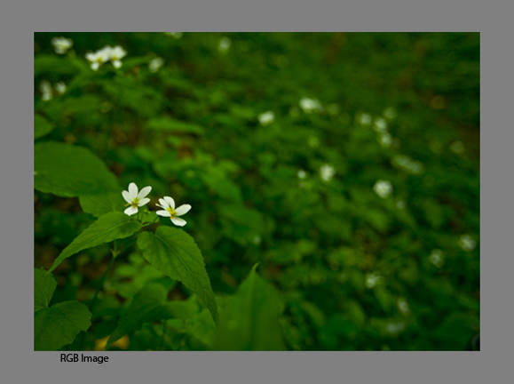
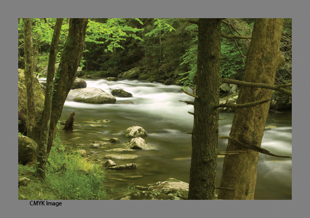
220 pages, 245 images, 11×13”
Quiet Light Publishing
Publisher’s Price: $60.00
Pre-Order Price: $45.00 (until June 1, 2009)
Four years ago today we released my first book, The Lewis & Clark Trail American Landscapes. As soon as you come out with your first book, the question is…so what’s your next project and when will it come out. Well, now. Kind of. You can now pre-order our second book, Great Smoky Mountains National Park: Thirty Years of American Landscapes. I have been training my lens on the park for just over thirty years so it made sense that my next book would on the park.
I began my quest to become a landscape photographer while on my first trip to Great Smoky Mountains National Park back in 1974 with my future wife, Kathy. I was not then as intense about photography as I am now. I was just beginning my journey and in all honesty wanted to find the closest national park to my home in Illinois. I chose the Smokies and the love affair began – between me and the park and between my wife and I. Since then I have visited many of our national parks, but I continue to be drawn back to the beauty, diversity, and complexity of the Smokies. It is, after all, a park that offers everything: historic buildings and living history, magnificent streams and waterfalls, a variety of old-growth and new-growth forests, large fields and coves with abundant wildlife, and of course, those stunning vistas into “smoke” filled valleys.
Over thirty years, many things have changed, and many others have stayed the same. The Fraser firs on Clingmans Dome have almost been destroyed by the Balsam Wooly Adelgid, yet younger trees now crowd the understory. Portions of the Alum Cave trail were inundated by a landslide during a thunderstorm. Cades Cove is no longer farmed. Logging operations cleared much of what is today parkland. Yet to the inexperienced eye, the places where lumber companies clear-cut mountainsides in the late 1800s and early 1900s are barely perceptible, a testament to both Mother Nature’s ability to regenerate and remove the scars of mankind, and to mankind itself for having the foresight to preserve this remarkable landscape. In some cases, entire species have disappeared from the area, like the buffalo and wolves, or even from the earth entirely as is the case with the passenger pigeon. But other species have been reintroduced. Elk have been returned to Cataloochee and have migrated into other areas of the park. The synchronized fireflies have been around forever, but only in the last 15 years have they become a popular treat if you are lucky enough to catch their 10-day show in early summer.
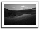
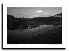
Some of these changes are reflected in this book, whether a black and white image of an old barn taken in 1976, or one of my last shots of a sunrise as seen from Newfound Gap in November 2008. I hope you will enjoy my vision of Great Smoky Mountains National Park. It is a jewel in our national park system. My wish is that you will come to love, as I do, the details of the leaves, the rush of water in the streams, the colors of the landscape as it changes from season to season.
You can preview the book using the link: GSMNP Book Preview
Our release date is July 1, 2009, but pre-orders start today, at the reduced price for readers of this blog of $45.00. So order now, and put the words BLOG in the comment area to insure your discounted price. We will not charge your card until we ship your order. Readers of this blog are the first to be able to order! GSMNP Book Pre-Order
Thanks! Hope you’ll enjoy this new release! Stay tuned for more as we move forward!
Richard Mack


